Valley Outdoor Co.
A premium outdoor services design where the quality of the work is visible before a visitor reads a single word — because that's how high-end landscaping is sold.
This is a design example — not a real business. It shows what we'd build for a landscaping company like this.
What a premium outdoor site has to do.
High-end landscaping is an emotional and financial decision. The average project is thousands of dollars, and the person considering it is imagining their backyard transformed. They need to feel the quality of the work before they read a word — which means images have to come first and the brand has to signal craft, not commodity.
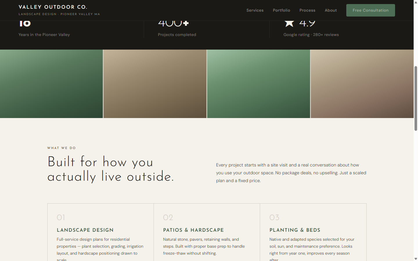
Most landscaping sites look like lawn care flyers. This one is designed to make a prospect feel like they're in the right hands from the moment the page loads.
A palette pulled from the materials.
Warm cream, deep charcoal, and sage green come directly from the materials a premium landscaper works with — stone, native plantings, wood — not from a generic template color picker. The typography is Josefin Sans: architectural and geometric, matching the precision and craft of the work.
The numbered service grid (01–06) and 4-step process section do the education work that usually eats up consultation time — so by the time a prospect calls, they already understand the process and have self-selected as the right kind of client.
The thinking behind the design
Visual hierarchy: images before words
A landscaping prospect buys with their eyes. The hero occupies 90% of the first viewport — maximum space for imagery, minimum chrome. Text explains what the visitor is already feeling, not the other way around.
Brand palette from the material world, not from a template
Forest green, stone, and gold are the literal colors of the work — flagstone, native plantings, garden lighting at dusk. A brand that comes from the trade feels authentic. A generic template palette signals "I used a website builder."
The process section closes calls before they start
"How does this work?" is the first question on every prospect's mind. A 4-step process section (Site Visit → Design & Quote → Build → Walkthrough) answers it in 30 seconds. Fewer consultations spent explaining the basics means more time selling.
"Fixed quote" appears in the first paragraph — intentionally
The two objections landscaping clients have before calling are: "I don't know what this will cost" and "I've been burned by open-ended estimates before." Surface the answer before they ask and the barrier to calling drops significantly.
Outdoor or home services business?
We build premium portfolio sites for landscapers, hardscapers, and outdoor contractors across the Pioneer Valley — so your best work is the first thing a prospect sees.